Category Archives: On Writing

The Art of Footnotes

Options Writing Footnotes

To all you book writers out there: have you given thought to how you would like your footnotes or citations to appear? For example, you can incorporate footnotes into the text like this:

Plato says that there is an ancient quarrel between poetry and philosophy (Pl. Resp. 607c). In fact, he bans the performance of tragedy in his ideal state…

Or, you can give the citation a footnote with a superscript numeral which refers to a citation at the bottom of the page:

Plato says that there is an ancient quarrel between poetry and philosophy.¹ In fact, he bans the performance of tragedy in his ideal state…

I guess this way is less intrusive for readers?–if they don.t want to break the flow of reading the argument, they don.t have to. Even less intrusive are endnotes. They look the same as the footnote except the citation is found at the end of the work. Hence the name. You might think endnotes even less intrusive than footnotes. In a way, you.re right. To me, however, books with endnotes necessitate keeping two bookmarks: one to mark where I.m reading and one to mark the corresponding location of all the endnotes in the back. If I don.t have both bookmarks (often the case), I find it quite distressing to be awkwardly flipping around for citations at the back of the book since, say it.s note 10. Well, every chapter has a note 10 so then you have to also find out which chapter you happen to be on. Some endnote systems get around this by placing a reference at the top of the page (something like ‘Notes from pages 353-372′) but then I think, ‘Why not just use footnotes?’.

Next are considerations of the abbreviations. In the first example at the top of the page, it could have read (PlResp. X: 607c) because it.s from book ten. If you don.t like roman numerals I suppose it could look like (Pl. Resp. 10: 607c). But if your readership is inclined to say, ‘What is Resp?’, you might be inclined to use some more space so that it becomes (Plato, Republic 607c). The abbreviation is confusing: Resp. is short not for Republic but respublica.

Then there are even more considerations. Some people will do footnotes for short citations (author, work, page number) but use endnotes for longer citations (controversial stuff that needs to be addressed but is not directly part of the argument).

Brief History of Footnotes (Nietzsche contra Wilamowitz)

There is an art to footnotes. After all, how citations are done changes the appearance of the page. It is part of the aesthetics of your piece. In an academic work, no footnotes give the impression that the writing is inspired (e.g. Nietzsche). Lay readers might find this satisfactory. But academic readers will want to know who your sources or ‘authorities’ are. Lots of footnotes gives the air of authority. Especially if your secondary sources are in different languages and are from bygone eras. So if you.re writing on Sophocles’ Oedipus rex and you quote Vernant (in French) and Rohde (19th century German scholar), you can throw off the impression of having great authority. But it.s sort of showing off as well: it could look pretentious. Speaking of pretentious, you can also quote yourself (this is like rock bands who wear their own t-shirts on tour). But hey, when you can quote yourself, you know you.ve made it!

One of my favourite scholarly articles is ‘Fussnoten: Das Fundament der Wissenschaft‘ by Stephen Nimis. No, it.s not in German. Entirely in English. The title is German because it.s the story of how the Germans shaped the use of footnotes in academic writing in the late 19th century. It was a battle between Nietzsche (whom we all know) and Wilamowitz (who is a famous guy no one knows). Professor Laurel Bowman had recommended it as a good read. And boy was it ever! Part satire and part history, it is a self-reflective look at the art of writing footnotes. If you have 15 minutes, it.s an incredibly entertaining read: click on the link above. Nietzsche and Wilamowitz were the top young philologists of there generation (like star athletes today). Nietzsche disdained the use of footnotes. Wilamowitz meticulously cited everything. In fact, if someone says ‘Wilamowitz footnote’ in describing your footnotes, it.s a sign of praise even today. Well, Nietzsche considered his writing inspired. He writes things like ‘Homer and Archilochus are two sides of the same coin from which poetry sprang’. I mean, how do you footnote that?!? Wilamowitz wrote these long and scientific footnotes. They got into a big fight. They dragged the biggest names in German scholarship into the fight with them. Even the musician Wagner joined the fray. Nietzsche eventually left (or was forced out of the establishment) because of the fight. He went on to bigger things. Wilamowitz led a very successful career as a classicist. After all the name calling, they all regretted the episode: Wilamowitz had been satirized as Wila-mops (mopish) and Nietzsche.s Zukunftsphilologie (philology of the future) had become Afterphilologie (philology of the ass) and all sorts of other pleasantries.

Anyway, after reading the Stephen Nimis article and learning of the art of writing footnotes, my writing started looking like this:

Footnotes Galore!

Footnotes Galore!

Look at that–the footnotes take up half the page! I.m particularly fond of footnote 23 which took a very long time to put together. Weeks of work and close reading. I almost went blind.  By the way, for those of you interested in fate, free will, and the problem of divine foreknowledge (how much is it decent for God to know in advance and can he change the outcome?), here.s a link to the entire article.

Choosing the Right Style of Citation

Why do I bring up the question of footnotes? I.m writing the last chapter of Paying Melpomene’s Price. It.s occurred to me now that the book works. I mean, that it.s possible. Better than possible. It represents a new contribution. This project of writing a philosophy of tragedy or a theory of tragedy has occupied me the better part of 20 years. There were false starts that took up years of effort that led nowhere: a theory based on the consolation of tragedy (it is not to you alone that this grief comes…). Then another on the different worldview of Aeschylus (go in alone), Sophocles (trust the gods), and Euripides (you get by with a little help from your friends).

When first starting work on Paying Melpomene’s Price (the working title back then was actually Wildness Waiting in Tragedy) I hadn.t kept track of citations at all. If it got published (a big If), it would appear without footnotes. But that.s not very helpful to readers. My thinking now is that that is sort of an unhappy way to write. A writer should be thankful to readers. And being thankful means making the writing easy and pleasant for readers to follow.  A book can be profound yet still a delight to read. Think of Austin.s How To Do Things With Words. It.s heavy duty theory but a delight with its examples of ‘The cat is on the mat’ (descriptive utterance) and ‘You.re fired!’ (performative utterance).

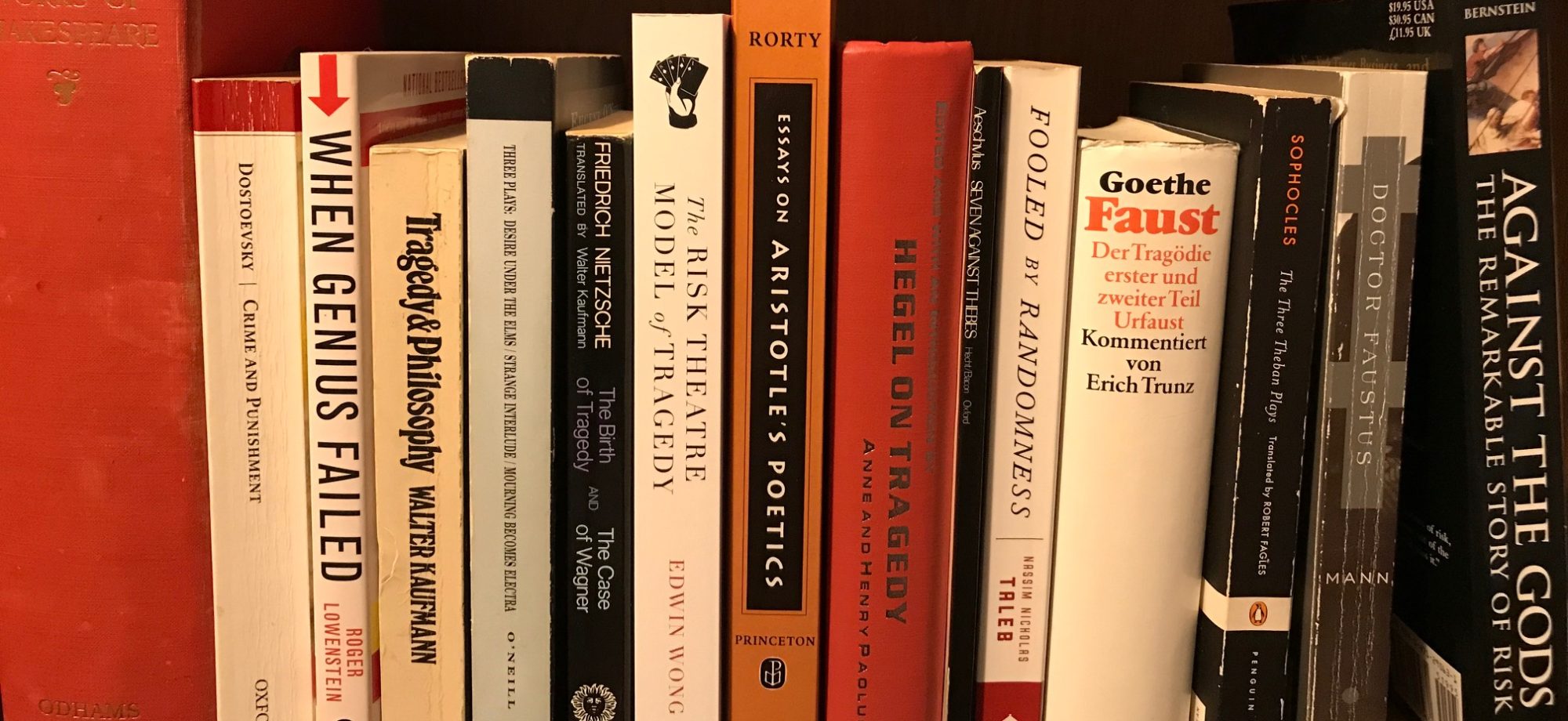
One thing self-publishing books have been recommending is to look at similar types of books to see what they do. You want your book to look like its peers. I decided to do a small sample. It seems books written in the last 20 years liked to use endnotes. Footnotes in the text would refer to the endnotes in the back of the book which were grouped according to chapter. Terry Eagleton’s Sweet Violence (2003), Nicole Louraux’ The Mourning Voice (2002), Peter Szondi’s An Essay on the Tragic (2002), Rush Rehm’s Radical Theatre (2003), and James Porter’s Nietzsche and the Philology of the Future (2000) use this arrangement. Some older titles use this arrangement, such as Richmond Hathorn’s Tragedy Myth & Mystery (1962) which is a collection of previously published essays.

Some (but not all) books which are collections of essays like to use footnotes in the text and print the notes at the end of each chapter. Examples include Richard Palmer.s Tragedy and Tragic Theory (1992) and Essays on Aristotle’s Poetics ed. Amelie Rorty (1992).

There is a distinct predilection for mid-century titles to print the footnotes at the bottom of the page. No flipping pages necessary! Titles of this ilk include George Steiner’s The Death of Tragedy (1961), Oscar Mandel’s A Definition of Tragedy (1961), Walter Kaufmann’s Tragedy and Philosophy (1969), and Herbert Weisinger’s Tragedy and the Paradox of the Fortunate Fall (1953).

Classic texts, or primary sources such as Nietzsche’s The Birth of Tragedy (which started out as a secondary source but is now considered an original creative work in its own right) are mixed. The 1993 Whiteside Penguin translation has collects the notes in the end. A 1968 Hollingdale Penguin Translation of Twilight of the Idols / The Anti-Christ by Nietzsche prints the footnotes at the bottom of the page. In addition, footnotes proceed by special characters such as §, ±, or *, instead of numbers. Fun reading. There are some ‘popular’ (but very informative) books such as Michael Tierno’s Aristotle’s Poetics for Screenwriters that have no footnotes at all.

What to Do?

Which style is best? I guess it depends what you.re trying to do. If I were doing a purely academic work, I.d have to go with the modern style of placing everything into endnotes. But Paying Melpomene’s Price isn.t just an academic title anymore. I.m too far away from the academy. It.s something else, a labour of love. A book inside of me that had to be written for its own sake. My favourite books to read conform to the mid-century footnote format: footnotes printed on the bottom of the page. I think that.s what I.m going to do. And the other thing: no more long elaborate footnotes! The sort of thing I.m arguing (tragedy as a high stakes game of death) shouldn.t really super involved notes. Either the reader grasps the idea intuitively (in which case not too many citations are necessary) or they.re not going to like it (too broad, too general, not a new contribution) and not amount of footnoting is going to convince them.

Footnotes on the bottom of each page seem to keep things more honest too: it.s visible, not swept under the carpet to the back of the book. They.re part of the aesthetic of the printed page. I think my style of writing changes according to the style of footnote (or endnote) used. With MLA style citing, I.d have less quotes. The brackets just look ugly. With endnotes, I.d treat them like a dumping place for stray thoughts–who know if anyone will actually flip to the back to read them? Footnotes on page bottoms have all the advantages. You.re giving people credit for ideas. You know readers will see them. Readers will feel they.re flipping pages faster (since pages are shorter by the space the footnote uses). Readers won.t have to swear and curse when they lose their spot looking up citations. It.s a win-win.

Thanks for working that through with me, assiduous readers! Until next time, I.m Edwin Wong and I.m Doing Melpomene’s Work, a little here and a little there until the work is done.

Dead Man’s Hand – The Artist’s Studio

Paid a visit yesterday to assiduous artist SB at her studio. She.s flying back to Brazil next week so that means that the Dead Man’s Hand cover illustration is going to be done real soon! Not only can she paint, she.s also a damn fine cook! Also there to enjoy her Melanzane alla parmiggiana (fried eggplants layered with meat and tomato sauce, basil, cheese, and on top a crust made with eggs and more cheese) was cameraman extraordinaire MR (who took care of photo shoot duties at the Cenote Lounge) and their significant others, R and M. It was fun to watch the artist showing off her creation and listening to everyone.s feedback.

Dead Man’s Hand Status

The last blog on the status of the cover illustration was last week. At that stage, all the individual sketches had been approved as well as the global layout for where everyone was going to be situated. Actually, the gambler on the left didn.t quite fit. He had originally been cast as the ‘cool gambler but as the picture progressed, it seemed better if all the characters exhibited a degree of surprise to maintain the unity of the theme (i.e. the unexpected). Since all the models sitting in that position had been playing the ‘cool’ role, this means that we had to find an unsuspecting model from the internet to fill the role on a last second basis. Also (since some of us are cigar aficionados) the decision was made to place an ashtray by the dead man’s hand poker combination to draw attention to it with a wispy trail of smoke.

In chronological sequence, here.s how things shaped up in the last week.

Dead Man's Hand - Outline

Dead Man’s Hand – Outline

The Photoshop image was printed out in a line format (outline mode) onto a full scale reproduction. From there, SB placed it on top of the watercolour paper with a carbon sheet in between and traced it out. Eagle-eyed readers might be able to see the outline of the characters on the carbon sheet:

Dead Man's Hand - Carbon

Dead Man’s Hand – Carbon

And really assiduous readers will be able to tell that some stuff moved around after the carbon transfer as well!–the table, Lucy (the husky), and the door have all moved to the left. Compare it with the photos below. This was done to increase the sense of perceived space and line up the poker hand I.m holding with the door.

Here.s the finished outline on the watercolour paper:

Dead Man's Hand - Outline

Dead Man’s Hand – Outline

Next comes colour!–

Dead Man's Hand - Colour

Dead Man’s Hand – Colour

What comes after that? If you said ‘more colour’ you win!–

Dead Man's Hand - More Colour

Dead Man’s Hand – More Colour

This pretty much is where the drawing was as of yesterday. Have you ever wondered how an artist.s studio looks while they.re working away?

SB.s Studio

SB.s Studio

When I got there, she had some incense lit at her workstation. Light is natural from the south facing window. It.s hard to see from the photographs, but the painting is a good size and the size looks impressive in person. You can get an idea of the size from the scale of the chair or the coffee cup, but it doesn.t do justice to actually seeing it.

Here.s the artist.s apparatus:

Watercolours

Watercolours

What.s next, you ask? The eyes aren.t put on yet. This gives the characters that timeless look of Grecian statues, which is sort of cool as well, though!

I hoped you.ve enjoyed what is probably the second (or maybe third)  to last blog on the Dead Man’s Hand cover illustration (things always go on longer than anticipated: I used to be an estimator for a construction firm in a past life). Meeting up for a celebratory dinner at my place next Sunday to wish SB and R a safe trip to Brazil and to wrap the project up. Thanks for tuning in, I hope you.ve enjoyed seeing the painting coming together as much as I have!

Until next time, I.m Edwin Wong and I should get cracking at Doing Melpomene’s Work if the cover illustration is almost complete!

Cards in Art

Assiduous artist SB is now transferring the Dead Man’s Hand cover illustration onto the watercolour paper. Boy it sure looks good!–

Dead Man's Hand Photoshop Final

Dead Man’s Hand Photoshop Final

I like the sense of space. Not too busy. The chips dropping out of the left gambler.s right hand herald the arrival of an unexpected guest. The cards arranged in the dead man’s hand occupy the focal point. That we dared to go with a full contemporary setting impresses me. So often, it seems that the urge to go with period dress from some other time seems like the right thing to do. But I think as a piece of art ages, part of its appeal will lie in how it captures how the people in the time it was created appeared and dressed, the furniture that they used, the types of venues they would frequent.

I think that.s one of the difficulties in doing crucifixion or religious scenes today. So many masters in the Renaissance tried their hand at them that they.ve sort of crystallized how these scenes should look in our minds: Jesus and his cohorts dress in Renaissance clothing and sport Renaissance hairdos and fashions. It is like trying to write a play in blank verse today. It.s almost impossible since the influence of Shakespeare is so strong that you.d end up just doing a poor imitation of the Bard. That.s what I like about the 20th century Canadian painter William Kurelek: he has the audacity to clothe the characters in his religious settings in modern garb. Here.s his Who is She that Cometh Forth as the Morning Riseth? And it works. The religious feeling is perhaps even amplified because the characters and architecture appear contemporary. They feel closer:

Detail from Kurelek Who is She that Cometh Forth as the Morning Riseth?

Detail from Kurelek Who is She that Cometh Forth as the Morning Riseth?

I thought I.d share a special treat with diligent readers today. In the book Poker Wit and Wisdom by Jerome and Dickson, there.s a top 10 list of playing cards in high art. To get an idea of what.s being accomplishing with the Dead Man’s Hand, it.s useful to take a look at how past masters have depicted cards.

First up is Raftsmen Playing Cards by George Caleb Bingham (1847):

Raftsmen Playing Cards

Raftsmen Playing Cards

Are they sitting on a pier or a large raft?–can.t see the feet of the fellow on the left. How attention is drawn to the cards is that they occupy the horizontal centre of the painting, 1/3 up from the bottom. The islands in the distance provide a natural frame to draw attention to the card players. A more honest game than some of the ones coming up.

Number two is Soldiers Playing Cards and Dice (The Cheats) by Valentin de Boulogne (1620-1622):

Soldiers Playing Cards and Dice

Soldiers Playing Cards and Dice

This painting captures the psychology of the gamblers well. Notice how mesmerized they are by the impenetrable uncertainty in the dice and the cards.

Here.s number three. The Cardsharps by Caravaggio (1596):

Cardsharps

Cardsharps

Hey what do you know?–one can look naive and expectant but be cheating at the same time! And the other players should be focussed less on the uncertainty in their hand to focus more on the stray hand of the cheater! Incidentally, the philosopher Ian Hacking used this painting to grace the cover of The Emergence of Probability.

Number four is actually a whole bunch: the House of Cards series by Jean-Simeon Chardin (1736-1737):

House of Cards

House of Cards

House of Cards

House of Cards

House of Cards

House of Cards

House of Cards

House of Cards

The delicateness of the models and the fact that they are building a houses of cards–the most unstable of structures–is what defines this series. There is no ominous sense in these pictures but the instabilities of the models and their buildings would suggest otherwise. It would be a fun experiment to see what sort of effect could be generated by making a house of cards with the dead man’s hand.

Number five is none other than Guardroom with Soldiers Playing Cards by Jacob Duck (1620-1660):

Guardroom with Soldiers Playing Cards

Guardroom with Soldiers Playing Cards

What better way to stay awake for a long watch! The stillness of the watch is amplified by the sparseness of the setting and the dull colour tones.

Number six is Glass of Beer and Playing Cards by Juan Gris (1913):

Glass of Beer and Playing Cards

Glass of Beer and Playing Cards

I think I see a card with some clubs on it and a rather frothy looking beer. Oh wait, there.s a card with some hearts too. Not sure what to make of it, but the orange tiles are a warm and inviting colour. More information please!

Onto number seven. Here we have Scene in a Gaming House from A Rake’s Progress by William Hogarth (1732-1734):

A Rake's Progress

A Rake’s Progress

What a busy den of iniquity! But maybe the rake is doing well?–he looks like he.s having a He-Man moment, you know the one when he pulls out his sword and says: ‘By the power of Greyskull!’.

Number eight is The Card Players by Pieter de Hooch (1663-1665):

The Card Players

The Card Players

It looks like the cards are a prelude for a different sort of a game! Do you think de Hooch should have used a different colour for the skirt for the lady by the window?–her skirt melds into the drapes/table/wall leaving her legless!

Number nine is A Woman Playing Cards with Two Peasants by Hendrick Sorgh (1644):

A Woman Playing Cards with Two Peasants

A Woman Playing Cards with Two Peasants

I like how the relaxed looking duck looks almost anthropomorphic. Lots of opportunities for painters to capture human psychology in these card portraits: here there is self-loathing, mischievous delight, and the winner going in for the spoils. What.s that that she.s won?–a jug of milk?

And number ten is also called The Card Players, but this time by Henri de Toulouse Lautrec (1893):

The Card Players

The Card Players

Everything looks very soft from the array of couches to the cushion/table between them to their flowing robes. I wonder what the preoccupation with red is in this era? Maybe a reaction to all the dull colours in the paintings from the sixteenth and seventeenth centuries?

There you have it, ten + one masterpieces! Ten established paintings and one emerging masterpiece. One thing is interesting: a lot of paintings from the sixteenth and seventeenth centuries. During this time, Pascal, Cardano, Tartaglia, and others were laying the basis for the science of probability using dice and card games. The fascination with risk and chance on the human mind seem to be an especial focus for paintings from that era.

Until next time, I.m Edwin Wong and risk, uncertainty, and cards are the tools for Doing Melpomene’s Work.

Dead Man’s Hand Newsflash

Artist extraordinaire SB has been busy in Photoshop composing the Dead Man’s Hand. Last week the discussion was on how to increase the sense of space in the rough draft and how to increase the sense that something unexpected was about to happen. To diligent readers jumping aboard the story now, the Dead Man’s Hand is the cover illustration for my upcoming title Paying Melpomene’s Price. The dead man’s hand is a poker hand (pair aces on eights) which stands in as a visual analogue of the unexpected because that.s the hand Wild Bill Hickok held when he was unexpectedly shot! It.s a fitting illustration because one of the central themes explored in Paying Melpomene’s Price is the disproportionately large effect the unexpected can have on the best laid plans of mice and men. Here.s the sketch before the brainstorming session:

Dead Man's Hand BEFORE

Dead Man’s Hand BEFORE

Bringing the Dead Man’s Hand Together

A good start! We wanted to do a couple of things to make it even better: 1) focus more attention onto the poker hand, 2) increase the sense of space, and 3) make it more obvious that something really bad is going to go down.

So the construction crew came in and busted down the bookshelf on the right wall, a table was added in the back right corner to suggest that the space extends to the right, a barstool was placed in the front left corner also to suggest that the space extends towards the viewer, the table was flipped 90 degrees, the staff door moved and left open (to generate space receding into the distance, and the sleepy husky was moved further into the background.

Results

Here.s how it looks now:

Dead Man's Hand AFTER

Dead Man’s Hand AFTER

Here are the details:

Bartender

Bartender

Wild Bill Hickok

Wild Bill Hickok

Go Ahead, Make My Day

Go Ahead, Make My Day

Poker Player #1

Poker Player #1

Poker Player #2

Poker Player #2

Poker Player #3

Poker Player #3

Server

Server

The changes look bang on! The gambler on the right holding his hand in a protective gesture really adds to the suspense. The space is nice too as it allows the eye to wander around. Moving the dog to the back also concentrates the action in the front and makes the action more concentrated, as the dog is having a snooze.

What.s Next

At some point, the Dead Man’s Hand is going to get transferred from Photoshop into a real watercolour painting. The creative team.s going to get together for another session in the next few days and talk about the gambler on the left and the bartender. Originally the gambler on the left was cast as the ‘cool’ guy, but contextually, it might work better for him to express some form of surprise. Same with the bartender. The only character not looking surprised is the ‘make my day’ barstool guy. But with the scowl, it sort of works even better for the overall tension of the piece: it give it more of an ominous edge.

There you have it! I hope the Dead Man’s Hand is coming together to your satisfaction! Until next time, I.m Edwin Wong and I have been Doing Melpomene’s Work.

Making a Business Card

After the embarrassing incident on the Galloping Goose, it.s high time to make a business card! For assiduous readers who haven.t read the post, here.s how it went down: I met two ladies at a cafe along the Galloping Goose. We exchanged stories on the self-publishing experience (one of them had published a book on caring for her husband through MS). They were also interested in tragic art theory (the other lady was perhaps an academic: she had met Joseph Campbell of The Hero with a Thousand Faces fame). Familiar with the business card swapping routing from the days at Bayside Mechanical, I instinctively reached for my business card so that they could look up the blog. While there were still Bayside Mechanical ‘Project Manager’ cards in my wallet (now collectible!), I didn.t have any for my new occupation. So I had to borrow a pen from the barista and scrawl ‘melpomeneswork.com’ in my decidedly less than stellar penmanship on a scrap of paper. To be honest, everything is so much typing these days, I.m not sure if I still remember how to write, or even print! The incident stuck in my head as a fail: not professional. Even if I.m a semi-hobo, one must take pride in what one does.

Melpomene’s Work Business Card

It was that afternoon on the wonderful bike ride back home that I resolved: ‘Come hell or high water I shall have a business card once again!’ (the ‘shall’ instead of ‘will’ to accentuate the determination). Could the Bayside Mechanical card be recycled? Maybe scrawl out ‘Project Manager’ and write … hmmm … ‘Hobo’? Or ‘Writer’? What is it that I do these days anyway? It.s probably not something in the normal lexicon of terms. And the Bayside card seemed too businesslike, since, well, it.s a business card. Here.s what it looks like:

Edwin Wong Bayside Business Card

Edwin Wong Bayside Business Card

There were also vintage T.W. Wong’s Family Holding Company (from grandfather.s name, Tung-Wo Wong) that could be modified. It had a nice graphic on it too:

Edwin Wong T.W. Wong's Family Holding Co Business Card

Edwin Wong T.W. Wong’s Family Holding Co Business Card

This one had been modelled after the Bayside business card. While the graphic took away the strictly business appeal of the Bayside card, the same problem remained: the occupation (whatever that is) that I.m in is not really part of the business world anymore. The card needed to capture the ‘artsy’ or even the ‘non-business’ side of things.

The boat image that.s incorporated into the ‘T’ of ‘TWW’ could have been retained. There.s plenty of images of Dionysus on a boat with the mast as a vine and grape leaves hanging off the sails. Since Dionysus is the god of the theatre (comedy and tragedy arose from his dithyramb), the image could anchor the association between the card and Melpomene’s work.

But on further thought, this seemed too cliche.

Time for a Google ‘Best Business Card’ Search

Google had lots and lots of samples of high quality business cards. Here.s one that looked promising:

Estudio Triciclo Business Card

Estudio Triciclo Business Card

What a great card! EA hit the nail on the head when she described it as a combination between ‘mug shot’ and ‘library card’. Looking at other cards, the trend is to have an image of the cardholder. But since it.s not like I.m famous, that would serve little point, e.g. ‘Is that … the Edwin Wong on the card?’ is not happening. It.d be cool to have an image on the card though to make it memorable. And those are the strengths of the Studio Triciclo business card: 1) it has an image, 2) image is memorable because it.s ‘anonymous’, like the part of the face you see under a venetian mask, 3) no address (not really required anymore), and 4) awesome retro typewriter font adds to the memorability.

To make this happen, talented photographer MR has snapped some shots. Here.s what they look like:

Edwin Wong Business Card #1

Edwin Wong Business Card #1

Edwin Wong Business Card #2

Edwin Wong Business Card #2

Which one to go with?–maybe one of each! And this weekend will get together with graphic designer extraordinaire EA to put it together. Here.s the layout thus far:

Business Card Layout

Business Card Layout

Not sure if diligent readers can make it out in the sketch, but under ‘occupation’ I am listed as ‘doing Melpomene’s work’. That is perfect: not ‘writer’ nor ‘project manager’ but simply ‘doing Melpomene’s work’–that is absolutely perfect because, well, it gets the idea right: it.s sort of ‘in between’ real occupations but an occupation nonetheless.

And then the reverse side? Well, it.d be a shame to leave it blank! Years (decades, actually) ago LH painted really captivating image of a falling dude. It.s a really memorable. Since tragedy can be construed as a fall, why not use him as the mascot? The goal is to take the colour out and have him as a line image on the reverse side. Here it is:

LH.s Falling Man

LH.s Falling Man

BTW it.s upside down, but the fall looks more dramatic this way with the one arm reaching back up to the heights from which he tumbled down.

Until next time, I.m Edwin Wong and Doing Melpomene’s Work will seem so much more professional once the business card come out. Like a kid on Christmas Eve I can.t wait!

Dead Man’s Hand Photo Shoot

It.s done! The Dead Man’s Hand photo shoot took place at the Cenote Lounge last Sunday. To all the assiduous readers, here.s a few photos and happy memories from the event. Although the Dead Man.s Hand is a spooky idea, the photo shoot was anything but!

Here.s me slaving away getting all the props together the night before:

Dead Man's Hand Props

Dead Man’s Hand Props

Because none of the roles were preassigned (except Wild Bill), I wrote up cue cards for all the different roles:

Dead Man's Hand Action Cue Cards

Dead Man’s Hand Action Cue Cards

Also had to make sure the dead man’s hand was in the deck of cards: pair aces on eights with the Queen of Clubs as the kicker card:

Dead Man's Hand-The Cards

Dead Man’s Hand-The Cards

Here.s ‘Wild Bill’ holding the dead man’s hand:

Holding the Dead Man's Hand

Holding the Dead Man’s Hand

Clockwise from the right, here.s R, EA, OZ, and EW posing as poker players. The lighting is just perfect. No need for the special photography lamps. We had to hold still for expert photographer MR to get all the shots. From what I could understand, he would take a photo of the group and then follow up with individual shots of the gamblers’ expressions. As MR lines up the photos, artist SB provides feedback. The intent is for SB to create the watercolour painting from the photographs so the communication between photographer and artist is crucial.

Gambler Group #1

Gambler Group #1

Clockwise from right here.s the second gambler group: MT, CK, LH, and EW. Having two gambler groups gives assiduous artist SB more options for the look she wants to achieve.

Gambler Group #2

Gambler Group #2

Besides the gamblers, the illustration also calls for a server, bartender, and barstool customer. LH nails down the surprised expression in playing the server. Hollywood lost a bright talent when LH decided to go in a different direction!–

LH as Server

LH as Server

And in the final shot, Cenote co-owner S got into the action by playing himself (bartender). Perfect: he.s got a classic 90s punk ‘Open Up Your Mouth and Say SNFU’ shirt! Photographer MR also hands off the camera to SB so he can get into the action as well. Here he is with the bartender doing a damn fine Clint Eastwood impression. Make my day!–

S and MR as Bartender and Barstool Customer

S and MR as Bartender and Barstool Customer

We had allowed an hour and a half for the shoot. Actual time was closer to an hour. With the great team we had, things went quickly. Everyone is all smiles after the shoot wraps up. Here EA is helping me take down the food orders. I had originally started writing down everyone.s orders on the little notepad but boy it is really hard to write all those words on a wretched little square of paper! It turns out EA had been a waitress many years ago so I.m glad she offered a hand!

Relaxing Post Shoot

Relaxing Post Shoot

And of course since we are all full of smiles we took a group photo for the blog at the entrance of Cenote. Damn you guys look like stars!

Dead Man's Hand Group Photo

Dead Man’s Hand Group Photo

THANK YOU to everyone for making this happen! To S, thank you for opening up Cenote early and letting us have access to the space. The tasty Cenote dogs sure hit the spot afterwards. I will have to incorporate them into my routine! To OZ and CR, thank you for making it down while 8 months pregnant and on move day as well! Can.t wait to hear the good news and to hear the name you guys decided on. To Ei: enjoy the cards, don.t worry I let your mom know the odds of pulling out the dead man’s hand is actually 1 in 2.5 million! Just make sure you shuffle well and you will do just fine! To C the Great, thank you for helping out on such short notice. Good luck on the Whitehorse adventure and I want to hear more about it before you guys take off!  To LH, I.m sure glad you were able to come down–we.ve been discussing the idea of this shoot on our runs for such a long time that you know more about it than I do. It was terribly nervous for me on shoot day, but when I heard you explaining to the other folks the idea behind the shoot so well, it totally calmed me down! To R, thank you for taking part in the shoot and an even bigger thank you to sharing the secret of the Brazilian BBQ with us later on. You are the BBQ god and we will carry on the tradition of expert steak making! To MT, thank you for helping out at the shoot. Even though I.ve left the construction industry, that I can count on you means more to me than ever. It.s going to be time soon for us to catch a show again soon! To EA, thank you for agreeing to come out on short notice and sharing the mighty Jeep Wrangler story. Synchronicity, what more can I say!–while you were buying the Jeep I was blogging about old times. But let.s make a meaningful coincidence happen sooner this time!

And finally, none of this would have happened without the efforts of diligent photographer MR and artist SB. Kudos to them for taking on a challenging commission from an unknown patron. To capture all the flashing thoughts and feelings in that split second after being surprised but before the conscious mind grasps what is going on is a serious challenge. They are capturing the moment between states like the moment liquid is flashing into steam but is not yet steam. But from what I can see, if anyone.s going to be able to do it, it.s going to be MR and SB.

There you have it! Until next time, I.m Edwin Wong and because I held the dead man’s hand and lived to tell the tale, I will continue to be Doing Melpomene’s Work.

Staging the Dead Man’s Hand

Dead Man’s Hand Photo Shoot

This is it! Photo shoot coming up at the Cenote Lounge Sunday, May 31st 2:30-4 with appys and drinks on the house afterwards. The Cenote Lounge is next to the Odeon Theatre and down a flight of stairs. Thank you to the owner for opening up a few hours early so that we can do the shoot. And thank you also to all the volunteers who are taking a big chunk out of their Sunday afternoon to help out. Don.t worry, it.s time well spent: when the book on tragic art theory sells ten million copies, you will be a star!

Not sure what I.ll wear to the shoot, thinking about trousers with collared shirt, no jacket no tie. But jeans and t-shirt would be equally appropriate. LH is thinking about wearing classic black dress and word is MR is going to break out the mighty cowboy boots and hat. Baseball caps (might work out well with poker brim) and bow ties have been mentioned. To me, best fit for the shoot would be something that is your style in a subdued colour. The centrepiece of the painting is the dead man’s hand and people.s astonished reactions to the loud entrance. Lots of options for attire.

There.s a cap of 10 people, we.re at 10 adults and one child (understandably the owner isn.t looking for the restaurant to be overrun!). Of the adults, 3 women and 7 men. Had wanted balanced numbers but couldn.t get it to go this time. Here.s the roll call:

1 LH

2 MT

3 Es

4 OZ

5 CR

6 Ei

7 MR

8 DR

9 SB

10 Ro

11 EW

I hope everyone can come, it.s going to be a blast! But if something comes up (which is the way of the world), please drop me a line so I can fill the spot.

Dead Man’s Hand Cue Cards

What.s everyones’ roles during the shoot? Good question! The talented artistic team nailed it down last night at Cenote over a few cold ones. Thank you to SB, MR, and Ro for their enthusiastic input. There.s seven roles. Everyone can play as many roles as they like: nice thing about digital photography, we can take lots of shots and select the best afterwards. I.ll have little cue cards made up for the day of the shoot so as you rotate into different roles you.ll can see what that character is up to. The backstory is that Wild Bill Hickok is playing poker with his back to the entrance, pulls out the dead man’s hand (pair of aces on eights). At that moment, the gunman enters and shoots him in the back of the head. The moral of the story is never to underestimate the unexpected. The dead man’s hand is the visual representation of the unexpected that.s made its way into common folklore (i.e. Dylan has a song about it, Motorhead sings about it, and so on).

Here are the roles:

Dead Man's Hand Concept Sketch

Dead Man’s Hand Concept Sketch

1 Bartender. Action: cleaning a mug, looking at gunman apprehensively. Thoughts: ‘Something bad is about to happen (but I.m not sure what quite yet)’. Personality type: experienced, seen it all.

2 Barstool customer. Action: turning head slightly towards gunman, looking with corner of his eye. Smoking cigar. Thoughts: ‘Make my day!’. Personality type: ornery, not impressed with what.s about to happen.

3 Server. Action: walking into kitchen, startled by sound of gunman entering, contorts body/head to look, carrying tray. Thoughts: ‘Shit!’. Personality type: easily frightened.

4 Gambler #1. Action: playing with poker chips, arm on chair, disinterested smirk. Thoughts: ‘Hmmmmm’. Personality type: cool, indifferent

5 Gambler #2 Action: hand on table, tilting body, about to get up, looking directly at gunman. Thoughts: ‘Shit!’. Personality type: interested in self-preservation.

6 Gambler #3 Action: focussed on game, turns to gunman with poker face. Thoughts: ‘A distraction to the game of poker’. Personality: stoic.

7 Dog: Action: sleeping, perks up ear.

8 Wild Bill Hickok: Action: startled, about to turn around. Thoughts: ‘Damn I shouldn.t have sat with my back to the door’. Personality: grizzled

There you have it. Comments and suggestions by assiduous readers always appreciated and welcome!

Until the Sunday shoot, I.m Edwin Wong and I am always thinking of ways of Doing Melpomene’s Work.

Does Tight Coupling Lead to Tragedy?

The Unexpected

It.s Friday afternoon and I.m finishing off the discussion of a crucial topic: how do dramatists generate unexpected outcomes? Tight coupling is one way. But before discussing tight coupling, let.s talk about the unexpected. Dramatists need unexpected outcomes, because, if outcomes were expected, where would the drama be in drama?–it would be boring without the unknown. But since the unexpected arises from the feeling of suspense, it can.t be entirely ‘out of the blue’ or ‘come out of left field’. In real life, the unexpected can come out of anywhere. A lump in the throat. A knock on the door at a strange hour. The day Kennedy died. But because suspense is a two way street between dramatist and audience–with the dramatist providing clues and the audience fitting together the puzzle–the unexpected in drama emerges from something the audience knows, or, in retrospect, could have known. That.s unexpectation. Which actually is a word: damn you spell check! What I want to share with assiduous readers to day is ‘tight coupling’. It is one way to create unexpectation naturally and seamlessly.

Types of Unexpectation

There.s a lot of ways to introduce the unexpected. Fate and the gods was the preferred old school method. Since the gods are more powerful, they can appear and do all sorts of things heroes don.t anticipate. And if you believe in fate and the gods–or at least believe in them within the context of the pay–you can accept that they cause unexpected things to happen. Other ways of generating the unexpected include: a lack of knowledge, thinking too fast, unpredictable responses from other people (et tu, Brute?), unintended consequences, and so on. Lack of power (fate), epistemological uncertainty (is that Desdemona.s handkerchief?), and ontological uncertainty (should I make a deal with the devil?) all can wrack havoc with expectation. Tight coupling is a little different. It.s different because it.s not a lack of power. You.re not scaling the golden walls of heaven shouting against the gods. It.s not ontological uncertainty (i.e. does God exist?). And it.s not epistemological uncertainty. What is it then?

Tight Coupling

Let.s ask the new god what it is. Wow, prayer answered in 0.59 seconds! Here.s google.s answer:

Google Search 'tight coupling tragedy'

Google Search ‘tight coupling tragedy’

Here.s a definition from a sociological site:

Coupling can be thought of as the distance or slack between individual components. Systems can either be loosely coupled, like cars on a sleepy rural highway, or systems can be tightly coupled, like cars on the freeway at 5pm in L.A.

Here.s a definition from a site breaking down a tragic lesson learned on Mount Everest:

Complex interactions become more dangerous if tight coupling also exists within a system. Tight coupling means one breakdown triggers a series of other problems. Tightly coupled systems have four characteristics: time-dependent processes, a fairly rigid sequence of activities, one dominant path to achieving the goal, and very little slack.

They speak of systems. In drama, tight coupling would be the interdependencies between all the stages in a plan. So, if in order to achieve goal x, you need a, b, c, and d to happen AND if any one a, b, c, or d go awry, x does not happen, well that plan is tight coupled. But if, in order to achieve x, you need a, b, and c to happen AND if one of them goes awry that.s okay because there.s different options available, that plan is loose coupled.

Tight Coupling in Tragedy

Romeo and Juliet is tight coupled. Friar Laurence gives Juliet the sleeping draught so she can feign death. Only he and her know about this. And she.s going to be unconscious so really only he will know. They.ll bury Juliet. Friar Laurence will inform Romeo of the proceedings by snail mail (he.s been exiled to Mantua). Then when she awakes in the vault, they.ll both be there to whisk her away.

The goal is for Juliet to avoid marriage with County Paris: as diligent readers will all know, she.s in love with Romeo and Romeo with her. But there.s just so much that can go wrong with the holy man.s plans: maybe Juliet will have an adverse reaction to the potion (it.s got to be powerful if it knock you out for two days), maybe she won.t wake up, maybe something with happen to the friar, maybe they.ll inter her six feet under too soon, or maybe Romeo will hear of Juliet.s death before the friar tells him the plan! Because so many things can go wrong and because if any one of these things goes wrong, disaster strikes the whole enterprise, Friar Laurence.s plan is said to be tight coupled.

What eventually happens is that Friar Laurence charges Friar John to deliver the letter detailing the plan to Romeo in Mantua. While visiting the sick, Friar John is detained because the sick house is sealed on suspicion of the plague. The letter is never delivered. But Romeo finds out from Balthasar that Juliet has died. The rest you know.

Because the friar.s plan relies on tight coupling, the chances of an unfortunate accident go up. Drastically. The suicides of both Romeo and Juliet can be traced back to Friar John.s failure to deliver. That he failed to deliver is because he visited a sick house that happened to be sealed. The sick house really has nothing to do with Romeo and Juliet. But because the friar.s plan relies on tight coupling, even things that normally have no effect have a crucial affect on the outcome.

Tight coupling is a wonderful way for dramatists to drop the unexpected into their dramas in a way that is believable and convincing. Especially today since tight coupling is widely understood. Our receptivity to tight coupling probably comes from an awareness that tightly couple computer programs can bring down the whole computer necessitating a restart. But here.s what I find strange: besides Romeo and Juliet, I.m drawing a complete blank as to which other tragedies are tightly coupled. I can.t think of even one other one! I know they just have to be out there! Ugh.

Until next time, I.m Edwin Wong and I.m wondering why some days it.s so hard to be Doing Melpomene’s Work!

Lights, Cameras, ART!–The Dead Man’s Hand

WILD BILL HOLDING THE DEAD MAN’S HAND

Here we go, starting to come together! Diligent artist SB has drawn up the concept sketch of the Dead Man’s Hand. Here.s what it looks like:

Dead Man's Hand Layout Sketch

Dead Man’s Hand Concept Sketch

Here.s a list of things that came into my head. Here.s a cut and paste of the email I sent back to SB:

Hi SB,

Good stuff! I like the back wall with staff door and the black swans all nice and discreet. Let me throw some ideas out there, see what you guys think:
-does the gunman enter on the left of the picture (bar side), centre, or right (dog side)?
-how could we create the illusion of more space? For example, could back wall move back 5’ or table where card players are sitting move to the right (opening up the middle)?
-which of the characters sees the gunman coming in?
-I like that the bartender is cleaning a glass, nice sense of motion. I.m wondering if there.s other ways to capture a sense of motion in the picture? For example, could the waitress be coming through the door or could one of the players be in the act of getting up or sitting down?
-would it be an effective way to draw attention to the dead man.s hand if there was a pendant light hanging over the table, something like this:
f-06b-ceiling-metal-lampe-black-funky-.jpeg
These are some of the things that jumped into my head looking at the drawing. Not sure how your guys schedules are next week, can we meet briefly to nail down the concept? Perhaps Monday or Tuesday.
Thanks,
Edwin.

Like I said in an earlier post, I.m sure appreciating a lot more all the time, energy, effort, and thought that goes into cover illustrations. Going through this has been a tremendous learning opportunity for me so far, glad to be working with a great team. Also met up with MR last night. He.s the other half of the dynamic duo behind the Dead Man’s Hand. I.ll be bringing my laptop to the photo shoot and we confirmed yesterday that his sweet Nikon camera is compatible with my MacBook Pro. I didn.t know all the technology that.s available these days (maybe it.s been out there for years!). You can tether the camera to the laptop and use the laptop screen as viewfinder. You can also control the camera.s functions right off the keyboard!-would you believe that? This will be a good feature as it will allow us all to crowd in front of the 15″ laptop screen instead of the little camera screen to see how the photos are turning out.

Wow, look at that, while I.ve been blogging away, SB has already replied!

Hi!

Great ideas!
Let me go one by one on what I think 😀
1. I think he could enter from the center, and we could cast a light/shadow of the door and the gunman entering on the floor.. so it would show like someone was coming in but without making it very clear. I was thinking of making the whole drawing from the point of view from the gunman because then the characters would be looking at who’s looking at the painting… (I’m not sure if that made sense)…
2. For more space we can just move the walls around. The last time we spoke, the idea was the make it a tiny space but that’s an easy fix! I’ll do it in the 3D room and send you some ideas. We can change the sofas and all for another table if you want, but it’d be hard to place the players more to the center/back of the room because they need to be the first thing in the drawing so the cards are bigger and you can see what hand he has.
3. For more motion, I’m thinking of making the waitress coming out from the kitchen, so she’d still be opening the door (I drew it wrong, sorry!). Also, I wanted to put a glass falling from her tray like if she got scared or something. One of the players could be sitting down, although I wouldn’t see them doing this in a poker game. What we could do is to have one of them playing with the chips, like if he was waiting for someone else’s turn.
4. I’m not sure if it’ll be necessary to have a lamp, but it could be done. I’d have to move the waitress otherwise the lamp would end up covering her face – I’ll see what I can do!
I’ll get a drawing tablet tomorrow and do some coloured previews in Photoshop, so we can have a way better idea for colours and light/shadows.
As for meeting, I’m good any day, whenever you guys can 🙂 Just let me know!
Thanks
– SB

I can see it must be a really interesting process for the artist as well when they.re doing a commission. I wonder if there.s any blogs out there written by artists who talk about their experiences working with patrons?–that.d be an interesting read.

Onwards and upwards! Until next time, I.m Edwin Wong, and I.ll be Doing Melpomene’s Work even if it involves holding the dead man’s hand!

Call for Art Going into Production

This is it! Assiduous readers will recall that I promised a special announcement today. Here it is. The call for art has been awarded to not one, but two lucky artists!–MR from Thornapple Productions who will be the man behind the camera lens and SB who will paint the watercolour masterpiece from an assemblage of photos. We met at my place earlier to finalize things and I took the opportunity to snap a photo for all the assiduous readers:

IMG_20150513_172618674_HDR


In case you.re wondering, the little stand on the left isn.t some weird torture device but rather a bicycle repair stand. Just to the left of it is the couch (not pictured) and whenever people sit next to the bike repair stand they always get nervous like it was going to snap up and claw them in or something. It.s actually rather safe and no, it.s not spring loaded like a mousetrap!

So, how was the call for art awarded, you ask? Good question! Believe it or not, MR was one of the very first people–if not the first–that I ran into distributing the call for art. Funny how things work out sometimes, no? He was just on his way out to lunch, so I asked if I could leave the call for art with him and come back in the afternoon. By the time I came back, he had texted SB and set up a time to meet later that evening at the Cenote Lounge. We chatted about the concept, and they gave me their websites with portfolio images. At this stage, the call for art was really in a rudimentary stage and the contract hadn.t been cobbled together yet. From their input, I eventually laid out the draft contract. From the initial meeting, I came to understand the that call for art was a little bit more involved than, ‘Can you paint the dead man’s hand?’. A real setting had to be involved. We needed live models. The scene would be need to be staged. This was all new to me, but I was glad they were asking the questions to get the wheels turning in my head! One thing I really came to appreciate more after thinking about the staging the dead man’s hand is the art of the cinema. There, everything is staged and now it occurs to me that to make a movie it must be a lot of work! Good communication and a good team must be so important when putting together even the shortest of movies.

The thing that caught my eye looking at SB.s website is that she does figurative art, or, in other words, draws people. That.s actually not that common in Victoria. Most artists here seem to specialize in wildlife or abstract art. The wildlife and landscapes I can understand just because there.s so much of that here in ‘Beautiful BC’, but the popularity of abstract art is harder to figure out. Maybe it.s an expression of individuality?–with figurative art you.re getting inside someone else.s head and with abstract art you.re getting inside your own head. Whatever it is, I am glad SB draws figurative art and does so with emotion. To me, the ’emotion’ of capturing the look of surprise is the one thing that would make the dead man’s hand come alive. The thing that caught my eye looking at MR.s website is the way he captures the light and shadows with the camera. ‘Inspired by Nosferatu’, he said at Cenote that evening. Nosferatu is a silent black and white 1922 movie where everything that is conveyed by speech and colour today must be conveyed by other means; part of speech.s capacity and the aesthetic capacity of colour is sublimated into a wonderful play between light and darkness. There is a theatrical aspect to his photography that would come in handy in staging the dead man’s hand.

It wasn.t skill alone–though they certainly have plenty–that led to the award to SB and MR. I got a good vibe from them. And what is more, it seemed to me that they had worked together in the past and enjoyed working with one another. To me, that goes a long way. Finally, I got the impression that they were genuinely interested in working on this project. That.s a big plus. If they were interested in it, then I would be interested in working with them.

That.s the interesting thing with commissions. I get this feeling that some artists don.t especially enjoy doing commissions. The commission ‘stifles their creativity’. Or the commission ‘doesn.t allow them to express their inner individuality’. The commission turns them off. But to me, wouldn.t the commission be in many ways easier and more fulfilling than having to come up with something original of the abyss of a google of ideas? I think back on grade school. Do you remember having to write a paper for the teacher? Now, wasn.t it easier when the teacher gave you a specific topic? I remember the ones where the teacher said, ‘Write anything you want’ were the hardest papers. There was just too much choice in the ‘write anything you want’ papers. It would be hard to get started because the amount of choice would just be too overwhelming. This would be like the artist that is to create something from scratch. Where to begin? Which way is up? Which way is down? The paper where the teacher assigns a topic is more like the art commission. Here there are certain parameters, guidelines, and concepts. The parameters, guidelines, and concepts make it easy to start. Nor do the parameters, guidelines, and concepts stifle the artist.s creativity. They merely provide a fixed framework within which the artist can draw out expression. Think on counterpoint and the fugue. These are the most regulated forms of music. They have the most rules and procedures: augmentation, diminution, augmented canons, and so on. But listening to the fugue, you can hear creativity in play because the rules give it a framework and form. That.s sort of like the art commission: it.s a form within which one can express their individuality and skill. Going back to commissions and music, Bach.s Goldberg Variations were commissioned and so were the Beethoven’s Diabelli Variations and Mozart.s Requiem. Are any of these masterworks lacking in creativity?

So, dear reader, I wanted to share the good news with you today that the call for art is going out to production. In the following weeks we will have a photo shoot and from the photo shoot maybe a month for the finished masterpiece. SB showed a sneak preview of a watercolour sketch of the dead man’s hand (in my hand nonetheless–I have held the dead man’s hand and lived to tell the tale!) and I.m looking forward to the results. For aspiring artists looking for words of wisdom commissioning cover art, I.d suggest you go out there to talk with the artists (rather than email) and to find like minded folks who you feel comfortable chatting with. The funny thing that I learned was that it.s not really necessary to come to a decision on whether the artist has the right set of skills because the artist will make this decision for you. How does this work, you ask? Well, if the artist has the right set of skills, they will know and they will be interested. If it.s not the sort of art they do, they simply won.t be interested!

Call for art going into production! Onwards and upwards! Until next time, I.m Edwin Wong and I am Doing Melpomene’s Work.